Yesterday I had a couple of errands to run that were taking me up the Wheaton way, and as I hadn’t been over to the new Yarn Spot lately, I decided to take a look.
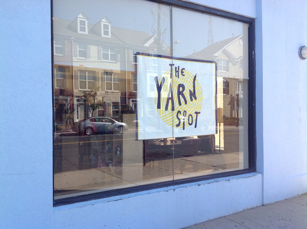
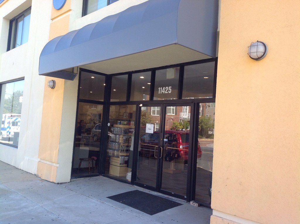
It’s located around the corner from the old location, in the former Brazilian Market. For now, they have a sign in the window. I’m sure the Yarn Spot sign will be over the awning soon.
It’s a larger space than the previous storefront, with a desk located in the center and yarns to either side.
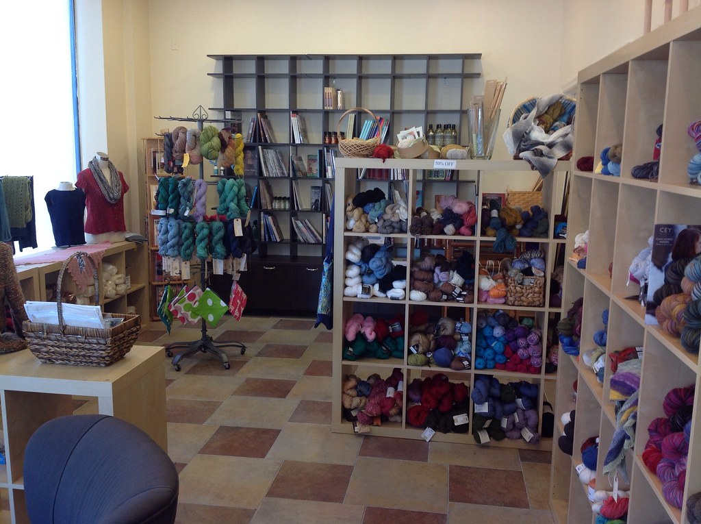
To the right, pictured above, are books, some hand-dyed, and what I believe were the bulky yarns, but don’t quote me on that.
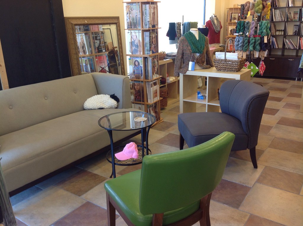
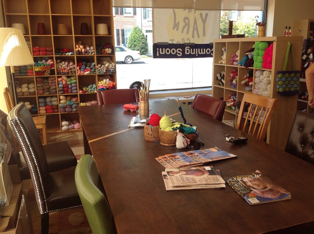
Directly to the side of that is a sitting area, where people can congregate, socialize, knit or crochet.
To the left is the bulk of the yarn, hand-dyed yarns hanging up, and lots and lots of shelves full of yarn. What strikes me about the new space is the sense of room – and the realization that The Yarn Spot had been very cleverly managing to cram more yarn into a smaller space without shoppers being aware. Here, the yarn seems to have more room to breathe, and with things placed a bit more apart, mobility challenged people will have an easier time moving around.
Instead of having needles behind the counter, needles are now kept next to the counter. This means it’s easier to look through the needles. With well-labeled boxes, I think it was easier to look through and find the needle I wanted. Still, they had the needles separated out into different brands. Perhaps it’s just my approach to organization, but I probably would have organized completely by size, and allowed brands to intermingle. But with many people being loyal to a particular brand of needle, it probably makes sense to have them separated out.
One of the things that really struck me was the wealth of natural light that is in the new store. It’s a hard thing to manage for yarn stores – on one hand, natural light conveys a welcoming space, and lets colors shine. However, sunlight can be very harmful to certain acid dyes, and cause noticeable fading. I don’t envy the store trying to balance the two elements, but it made the space particularly welcoming, especially at the table area for classes.
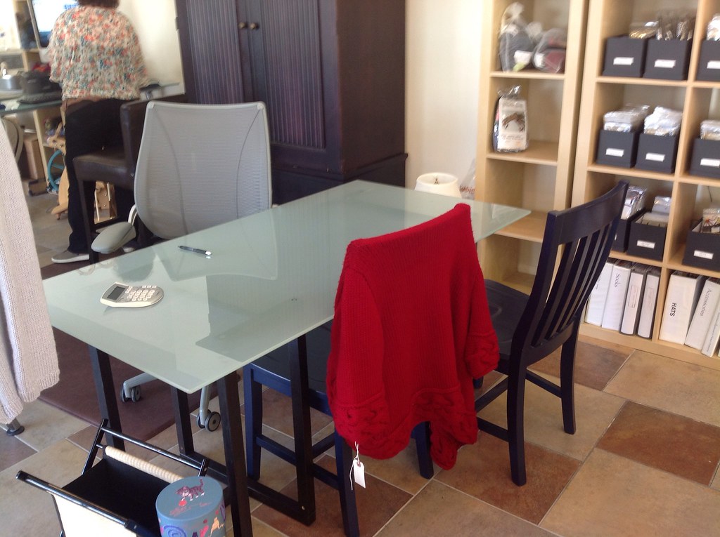
Another great element to the new store is a help desk, right next to the register. Isn’t it lovely?
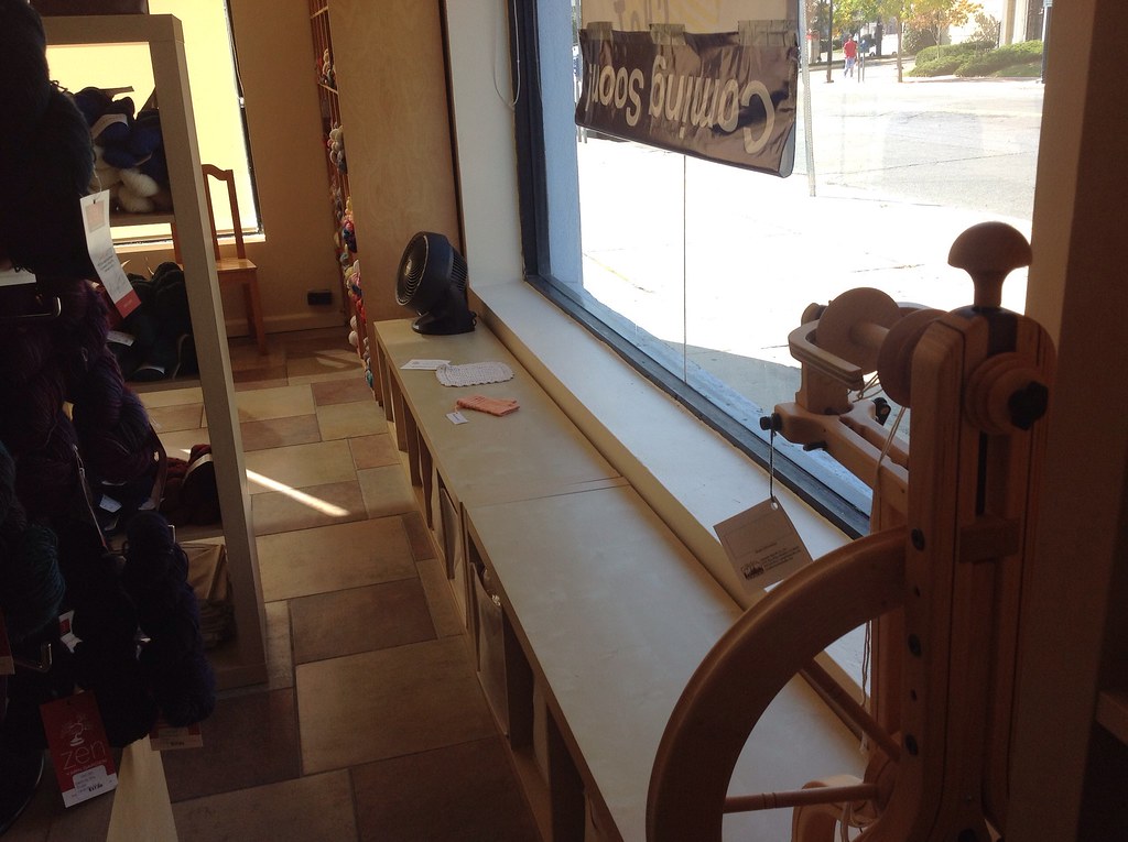
Perhaps my favorite feature of the store is these shelves against the windows. I think, if you added pillows or cushions, these would make the most perfect window seats. This is perhaps influenced by my burning desire all my life to have a room with a window seat.

